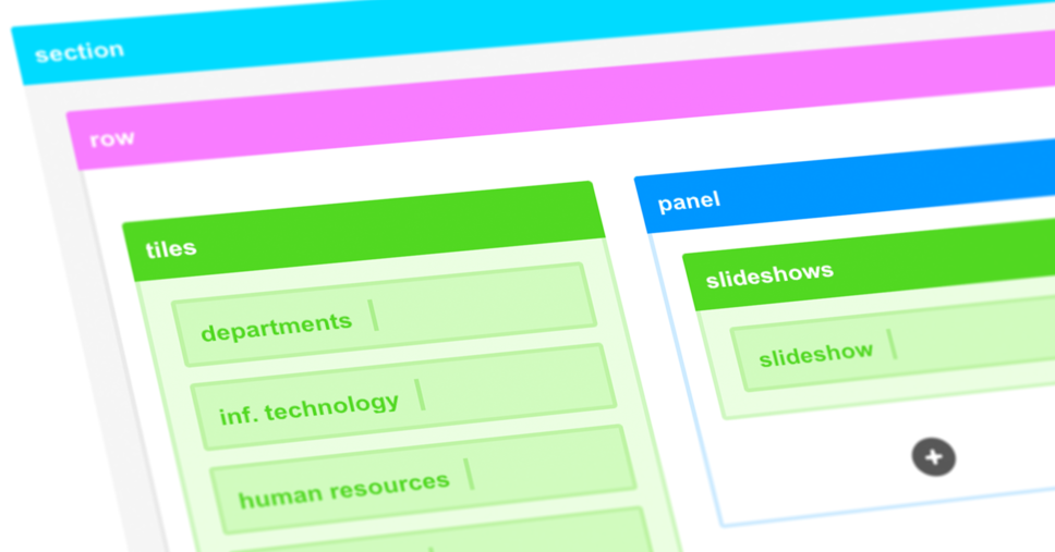
The ShortPoint wireframe you are used to is getting a makeover. Yes, we have not forgotten about the trusty wireframe design tool our existing users are familiar with and have learned to love. We are introducing some cosmetic and practical improvements to our user interface that will complement the new features of ShortPoint Visual Builder as you build your SharePoint intranet pages. You still get the outstanding functionality of the old wireframe with a splash of color and fluidity to bring in a supercharged user experience.
Adding Color to Your World
We are doing away with the predominantly grey and blue hues associated with the ShortPoint interface and mixing in more playful and radiant colors. You are now greeted by an exciting workspace that packs the best features and tools you can find in a SharePoint design tool.
Insert Design Elements on the Right Spot
We are making access to insert design elements through ShortPoint Page Builder more dynamic by attaching them to element containers. Add a design element where you intend them to be added without any guesswork.
The ShortPoint Visual Builder release is just around the corner and we are very excited to share all the improvements and new features with you. Hang on and soon you will get to experience what we carefully developed for a better design experience when building your finest work yet. Making things effortless while producing wonderful SharePoint intranet sites and Microsoft Teams tabs are our business.
[sc name=”vb-countdown”]

