We are taking the SharePoint Intranet design experience to the next level with ShortPoint Visual Builder. Style attractive and functional SharePoint pages with an easy-to-use visual interface, a real-time view of the page as it is designed, and effortless access to design options and elements.
The Usual Problem with Visual Builders
If you have experience with any of the available visual site builders in the market, you know that there is much room to improve on their user interface. Cluttered UI controls layouts result in a longer learning curve and create frustration. Elements are also hard to access which makes designing and editing take too much effort and time.
In this article, we will introduce you to EasyPass. It is one of the major features that you should look out for in Visual Builder that provides a fresh take on UI controls and removes the guesswork in selecting elements you want to customize and resize on the page.
EasyPass: A New Approach to Intuitive Visual Builder
Let’s look at EasyPass main features to see why and how they make ShortPoint Visual Builder special.
Easily identify design elements on the page
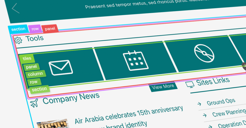
EasyPass displays identifying labels and color highlights for each design element that is present on your SharePoint page making it effortless to know which type of element is used in your content. Simply hover over specific design elements on your SharePoint page while in edit mode to see the labels. Select the label of the element you wish to customize and apply changes straight away.
View content structure instantly
Often, you will have a complex combination of design elements on your page. One design element may be nested in a few other design elements. When editing your page, determining the right part to modify may prove difficult and time-consuming.
With EasyPass, all you need to do is hover over any of the child elements to show its parent elements defining its structure. If you want to edit one of the nested elements in the structure, just click on the label and proceed with the design you wish to achieve.
Modify element spaces directly in focus mode
Selecting the design element labels brings you to the EasyPass focus mode. Just drag the outer lines of the design element to adjust its paddings and margins. You no longer have to toggle back and forth between the settings window and the preview of your page to get the right amount of space you need for your site layout.
We hope you are as excited about Visual Builder as we are. Watch out for more posts from us about what else you can look forward to at ShortPoint. We hope to continue to fuel your creativity and help you achieve the best output possible in your designs.
[sc name=”vb-countdown”]

